Debunking COVID Ghost Stories

It is October, the spookiest month of the year. Halloween is nigh.

In the spirit of the holiday, many people have been posting their favorite horror movies on Twitter. I’m not a huge fan of the horror genre, either movies or books, though. Except, wait… the first manuscript I ever wrote was a horror novel 🤷‍♂️.

Oh well, anyway, instead of sharing my favorite horror movies, I decided to share my favorite COVID scary stories, where things go bump in the night – no, wait, that’s me trying to walk around drunk in the dark – where the virus spreads like… whatever it is that turns people into zombies. The kind of stories meant to strike fear into the hearts (and lungs) of children and adults alike.

Except, if you’re a scientist, well… they’re not very scary.

We start with the month preceding October, not so long ago, when Summer turns to Autumn, the leaves begin to change colors, and Halloween draws closer. Bloomberg published this:

In a “study,” survey respondents reported lingering symptoms even months after recovering from COVID. Symptoms like fatigue, heart palpitations, dry or peeling skin 🤔, feeling irritable 😕, and hair loss 🤨. Hair loss! Oh no, I must’ve contracted COVID ten years ago!

Dig a little deeper and you’ll find that this “study” was conducted by putting out an ad on Facebook, asking for anyone who had some medical problems – and also claimed to have had COVID – to complain about them.

Image

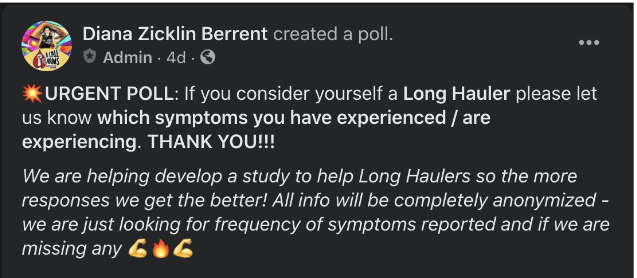
Yeah, sorry, but nothing to see here. Lots of people have medical problems, pandemic or no. This one’s about as scary as a bunny costume – provided you’re not a vengeance demon. (That’s a Buffy reference, btw).

Our next tale of the COVID underworld takes us to Penn State, where researchers tested the Big Ten’s athletes and discovered that among those who tested positive with COVID, a third of them had myocarditis (inflammation of the heart), which CAN BE FATAL.

Well, as it turns out, water can be fatal, too. Also, as it turns out, the numbers were misreported:

The actual study, not conducted by the person who the original report was based on, found the actual number at around 15%. Still bad, right! Um, maybe? Maybe not? What’s the problem here?

THERE’S NO CONTROL GROUP. We have no idea how many athletes who didn’t get COVID would appear to have myocarditis.

Guys, if you’re gonna play in Texas, you gotta have a fiddle in the band, and if you want to do real science, you gotta have a control group.

Additionally, it’s believed that seasonal flu, which is clearly not COVID, may cause myocarditis in up to 9% of patients. I think it’s also plausible that young, elite athletes may occasionally develop myocarditis simply from the rigors they put their bodies through. We simply have no reason to believe these results are scary from this study alone. I rate this story 1.5 candy corns out of 5.

Now for a study that actually did seem scary at first: An observational study of 100 post-COVID patients in Germany, where 78 were found to have heart abnormalities. 78%, horrifying!

But here’s the thing – some of the comparisons they made were between COVID patients, many of whom were older and had pre-existing conditions, and young, healthy people. That’s not appropriate use of a CONTROL GROUP. When they looked at non-COVID patients with similar risk factors to the COVID patients, they still found a number of heart abnormalities. Furthermore, for the metrics they used to measure heart health, the post-COVID patients still had values considered to be within mostly healthy ranges.

Here’s a quick rundown from an actual expert (unlike me) on this stuff :

All right, we’ve survived our COVID haunted house so far. Not nearly as unpleasant as this:

One last ghost story, and I promise so much candy for everyone we’ll all puke for hours.

Bloomberg Opinion published another scare story recently:

The column references two studies: the German heart study I mentioned above, and an observational study carried out in China. I hadn’t seen the latter before, but from a quick skim of this paper, I see some important points:

  • NO CONTROL GROUP
  • Every single person in this study was hospitalized with COVID
  • There was a significant decline rate from the study invitees (~25%); I would guess the decliners were healthy enough to turn down medical care
  • Patients with abnormal lung CT scans were much older than those with normal scans
  • Of those patients with abnormal lung CT scans, only about a third actually had abnormal lung functionality

Putting all of these together, it seems very likely that (almost) everyone in the group with any real problems post-COVID was ALREADY QUITE SICK before they contracted the disease.

Now don’t get me wrong, none of this proves there are no long-term negative consequences for people who recover from COVID. Plenty of people are getting sick for real, and it does appear the (mild for most) symptoms for COVID last for much longer than the flu and common cold. But I still have yet to see a CREDIBLE scientific study which shows that a significant percentage of otherwise healthy people continue to suffer from serious medical conditions well after recovery.

Also, let’s understand that, in all likelihood, nearly 20% of Americans have been infected by COVID at this point, and most of those people are unaware they’ve actually had it. If a really large percentage of us were likely to experience serious medical problems after recovery, I’d expect to have already seen reports of massive waves of unexplained medical problems. Maybe we will, but you should never assume something will happen when there’s no evidence for it.

Ok, I’m done for now. Hopefully we’ve all had fun scaring ourselves for no good reason (yes, yes, people die from COVID, I’m aware. I’m specifically talking about people that recover here). Now it’s time for me to dig into my candy stash (and my Miller Lite stash, of course).

Population Immunity vs COVID-19 Spread Rate, Cont’d

In my previous post I demonstrated a strong negative correlation between cumulative COVID cases and the Rt (current rate of reproduction of the virus) on a countywide basis in the US. I mentioned, though, that my quick and dirty data analysis was incomplete – a univariate analysis can be misleading if there are confounding factors. In this post, I expand the data to a multivariate model to examine possibly correlated factors.

For those who think the hypothesis I expressed in my previous posts (that population immunity is the primary factor determining Rt) is wrong, there are two likely counterarguments:

  • People in regions more strongly impacted by COVID take it more seriously, leading to more social distancing and mask wearing.
  • Mask mandates have generally been introduced in places with high case loads, and its those mandates that are mostly responsible for the reduction in spread.

The multivariate model I present here includes 3 new factors:

The base dataset and date ranges remain the same as in my previous post. Each datapoint corresponds to one major county in America every 4th Tuesday. Here are the results from an OLS:

Multiple linear regression results predicting Rt by county. High Cumulative case /capita and mask mandates both show strong statistical significance in lowering Rt. Current cases and social mobility fail to pass the significance test (p=0.197,0.225).

The R2 value isn’t terribly high, so we need to be careful about making strong conclusions (lower R2 indicates a lot is left unexplained). But the results do suggest some meaningful takeaways:

  • My view remains unchallenged. Even after accounting for social mobility and mask wearing (mandates), the cumulative case rate (which is associated with population-level immunity) is by far the best predictor of Rt.
  • Surprisingly, the coefficient for mobility is negative – which would imply that higher mobility leads to reduced virus spread if the coefficient was statistically significant (p<0.05). It is not. This could suggest that Stay at Home/Shelter in Place orders may have been worthless for containing the spread in America, though I suspect it might instead mean that the mobility data doesn’t accurately measure what’s meaningful in spreading the virus. I think weather may play a major role here – if people are going places, but staying outside during the summer, that would be effectively quite different from traveling places in the winter, when gathering must occur indoors in much of the nation.
  • Mask mandates do appear to contribute to reducing the spread, though they don’t guarantee anything.
  • Current Case /Capita does not seem to matter (another indication that people in current hot spots don’t adjust their behavior, thereby causing a reduction in Rt).

Some notes and caveats:

  • I normalized all input variables to have zero mean and stdev=1
  • I smoothed the Apple mobility indexes with a 14-day moving average, then computed a single score by averaging the walking/driving/transit scores. This score may not give the best predictor of Rt, but I wanted to keep it as simple as possible.
  • Ideally, the mobility data would’ve been measured year-over-year, instead of indexed in January. But this is the data I have.
  • I should’ve smoothed the Current Cases /Capita with a moving average, but I got lazy.
  • The statistical significance numbers are likely to be modestly overstated, as the data is likely not all 100% independent (bordering counties, repeated points from same location 4 weeks apart).
  • I got most of the dates for the beginning of statewide mask mandates here, though I had to Google 2 or 3 missing dates. Some counties/cities had mask mandates before their states implemented them, but I’m not sure I’m willing to put in the time/effort to collect that data.

Population Immunity vs COVID-19 Spread Rate

In my last post, I mentioned the idea that population immunity, or the total % of the population that has been infected, is a major determinant of COVID-19 spread. I displayed a chart of daily new cases in NYC and compared it to social mobility data, showing an apparent negative correlation between mobility and cases. My assertion is that population-level immunity is more important than many other factors in determining how fast the virus spreads. I’d like to add a little more support for that view here.

Another piece of anecdotal evidence comes from my second home, Los Angeles County:

From the above chart, you can see that the daily new case count peaked in mid July, even though lockdowns were enforced beginning in March, and a mask mandate has been in place since May. Yet from mid July, new cases have been steadily plummeting, even with little or no decrease in mobility since that time:

Now, anecdotal evidence is all well and good, but I much prefer statistical evidence when available, so I pulled some county-level data from a COVID tracking website, with estimates for the Rt value by U.S. county for each date during the crisis.

*I’ll note before giving the results that a more complete analysis than I’ve done would incorporate multiple variables (e.g. mask usage, mobility) to ensure I’m not picking up on secondary effects from correlated variables. Perhaps I’ll look at doing that in the future, but that requires substantially more work.*

(Update: My follow-up post looks at a more complete model).

I filtered the data to select only counties with a population of at least 250k, which gave me a total of 273 counties. I looked at the (smoothed) Rt values for every Tuesday during the crises, comparing them to the % of the population that had tested positive for COVID by that date. Here’s a scatter plot:

The correlation between these 2 variables is -0.52. Of course, there are many other factors that determine Rt, some of which are mostly random, but population infection rate (immunity) is clearly a large factor. Note that everyone agrees the total number of infected is much greater than the number of cases, though the ratio varies by region. With a 10x multiplier (typical for the U.S., I think) a 2% case rate implies 20% total infected.

Here’s a box plot comparing Rt for all instances above/below a threshold of 2% total case rate:

A statistical comparison of the 2 datasets gives:

The significance stats are somewhat overstated, as successive Tuesday’s numbers for each county will not be truly independent. But I’ve tried running these analyses by “undersampling” the dates (e.g. only using 1 Tuesday per month, or even less), and I still saw strong significance in all tests.

As I mentioned in the previous post regarding NYC, these high case rates don’t indicate real herd immunity. Instead, I suggest we stop thinking about herd immunity as a binary concept, and realize that for places with low population immunity, suppressing the spread is incredibly difficult, regardless of social distancing, masks, etc.

Immune, But For How Long?

I believe we can now be confident that immunity from COVID-19 lasts for at least 6 months, whether an infection becomes symptomatic or not.

During much of the pandemic, all kinds of doomsayers and worry-warts have cried about COVID immunity disappearing. Here’s a paper that shows recovered patients that never developed symptoms were far more likely to lose their antibodies within 3 months than patients that got sick. With asymptomatic infections currently estimated at 40% of all infections, that could be a real concern.

We’ve also now seen several documented cases of legitimate reinfections:

Recently, though, a team of Chinese scientists published a paper that studied symptomatic COVID patients, showing that antibodies were still detectable 6 months after infection. But that still didn’t answer the question of lasting immunity in asymptomatic patients.

I believe we can safely say immunity will last for 6 months or longer in almost all people who are infected by SARS-CoV-2. Here’s why.

Back in April/May, I had a series of python scripts I ran daily which generated charts from curated COVID data in the U.S. One major phenomenon I noticed was that the trends in deaths/cases in New York were diverging greatly with the rest of the nation. New York deaths steadily dropped, while deaths in the rest of the nation continued to increase for quite a while before they finally peaked.

Given everything we knew at the time, I found this surprising at first. How was it that New York was able to get control of this, given all their inherent disadvantages, while the virus continued to spread around the rest of the country? Were people in NYC social distancing more? Was Andrew Cuomo some kind of hero?

No. Andrew Cuomo is neither a hero nor a competent governor. My hypothesis at the time, which I now believe has shown to be true, was that NYC had reached a level of public immunity necessary to keep the Rt of the virus below 1.0 (update: some more evidence on this). This is not to say they actually reached true herd immunity (which is what I originally thought before any of the seroprevalence studies were published). If NYC were to go back to completely normal, they would almost certainly see a surge in cases. But with some levels of social distancing, they have enough immunity to keep cases from surging.

Here’s a chart of NYC cases over time, smoothed by applying a 7-day moving average:

Now, some people will continue to argue that the real reason cases were brought down and remain low is that NYC is still locked down and citizens are still exercising extreme social distancing. What does the mobility data for NYC, provided by Apple, say about that?

Note that mobility in NYC hit bottom about a month before cases peaked. After the peak, as cases continued to decline, mobility continued to increase. (A couple of caveats: it would be better if the mobility were measured as year-over-year, instead of indexed to Jan 1. Also, the cases shown are impacted by testing availability).

What’s especially important is that even 6 full months after the mobility trough, we haven’t seen any real surge in COVID cases in NYC. If a significant percentage of people infected with COVID were to lose their immunity after 6 months or less, symptomatic or not, we’d almost certainly see some surge in NYC by now.

Given that the number of genuine reinfections worldwide has been limited so far, I’m now guessing that immunity will last a year or more. Of course, that’s less certain at this time.

Not to Get Too Political, But…

I will. Maybe just this once.

This is supposed to be a SF blog. Now, you might think SF stands for sci-fi, but that’s not quite right. The well know acronym for sci-fi & fantasy is SFF, which I see as two distinct (though sometimes overlapping, I guess) genres. I write fantasy, but not much sci-fi. I do sometimes talk about actual science, though, so SF = science & fantasy. Not to be confused with science fantasy, which is a blending of the two genres, as in Star Wars.

Anyway, back to the politics! With a dash of science!

So you may have heard of this guy named Trump. This post really isn’t about him, it’ll just seem like it to begin with. Believe me, I’m as sick of him as you are. Anywho, last night I saw a tweet pop up in my timeline that riled me up a little bit:

I’m no fan of Trump, and I believe he’s handled the pandemic poorly, like he’s handled most aspects of his presidency poorly. But the idea that governors and mayors, be they Democrats or Republicans, have failed so badly only because Trump hid information from them is ludicrous.

So I snarked back just a bit:

Yes, the reply tweet with my Amazon receipts is mostly a joke. Even so…

Let’s go through a timeline of events from January to early March. I bet I can convince you that you don’t need to be a very unstable genius like me to see that state and local government leaders should have seen this coming, with or without Trump’s actions.

Note that all information laid out below, to the best of my knowledge, was publicly available to everyone on the date provided, not retrieved from a secret government database months later. Oh, except the irrelevant and stupid personal references.

Jan 7, 2020: China announces a cluster of pneumonia cases attributed to a novel coronavirus.

Jan 15: Japan reports a confirmed case of COVID-19.

Jan 20: The U.S. reports its first confirmed case of COVID-19, a man who recently traveled to Wuhan, Hubei Province, China. South Korea reports its first confirmed case, a Chinese woman.

Jan 21: Taiwan reports first confirmed case.

Jan 23: Strict Wuhan lockdown begins. South Korea reports its first case in a resident.

Jan 28: Taiwan reports its first case of local transmission.

Jan 30: The U.S. reports its first case of local transmission, from a man to his wife in Chicago.

Jan 31: Spain reports its first confirmed case, a German tourist. Italy reports 2 cases in Rome, a pair of Chinese tourists. Italy suspends travel to/from China. The U.S. announces travel restrictions to/from China.

Even before February, we’ve already seen reports of local transmission in 3 nations outside of China, and cases in multiple European countries. Think about what that means, given that most nations lacked reliable tests at that point.

Also Jan 31: Paper published in The Lancet estimating the R0 of SARS-CoV-2 to be above 2.5. This is MUCH higher than seasonal flu, meaning it’s far more infectious and spreads faster and easier (you probably already know that by now). Later estimates would place the value even higher.

Image

Feb 1: Hong Kong announces that a man who has recently traveled on the Diamond Princess has tested positive for COVID-19. In the following days, after the ship was quarantined, hundreds of passengers would test positive, even though nearly half of the patients had no symptoms at the time.

Feb 4: South Korea suspends travel to/from Hubei Province, China.

Feb 5: South Korea announces a new total of 19 cases, sourced from at least 3 different nations excluding China.

Feb 7: Kevin flies from Los Angeles to Milwaukee, getting plenty drunk in the process. But he may have imbibed more than just alcohol that day…

Feb 13: Bloomberg reports that Ira Longini, an adviser to the World Health Organization who tracked studies of the virus’s transmissibility in China,
estimates that 2/3 of the global population could be infected by SARS-CoV-2.
(paywalled)

I can’t imagine why no cases, they’d performed all of 0 tests at that point.

Feb 14: Kevin watches Contagion for the first time ever… WHILE HE WAS SICK, MIND YOU, I WONDER IF THAT COULD BE RELEVANT IN SOME WAY.

Feb 19: Iran announces a cluster of confirmed cases in Qom.

Feb 21: Italy reports its first cluster of local cases (northern Italy).

We’ve already observed clusters of major spread in many parts of the world, even as major nations like the U.S. were failing/refusing to test anyone who hadn’t recently traveled to Wuhan, China, regardless of symptoms. By now, if not earlier (yes, earlier), you should be able to see that the cat is out of the bag, or the genie is out of bottle, or I’m out of booze, or something like that.

Feb 23: Kevin watches Outbreak for the first time since he was a teenager. (it’s just as good as he remembers)

Feb 24: Nancy Pelosi visits San Francisco’s Chinatown, downplaying concerns about the safety of doing so.

I’m trying to be fair and balanced here, just like Fox News.
It’s now estimated that well in excess of 10,000 New Yorkers were infected before March 2nd.

Was that trip down memory lane fun for you? Hope so.

I don’t claim to have predicted that here in September, many of us would still be working from home, or that bars & restaurants would still be closed by government mandate in many places in the U.S. By February 14th, when I had my Valentine’s date with Contagion, I had fully accepted that I would get COVID this year (assuming I didn’t have it already). The infection fatality rate (IFR) for COVID is clearly much higher than the flu, but it now appears to be well under 1%. We know (have known since January) that the IFR is heavily age dependent, and anyone under 65 is highly unlikely to die or even need to be hospitalized. I honestly thought we’d try a few extra precautions, get people to wash their hands more, maybe wear masks at times, then just power through. Hoo boy was I wrong about that part.

On another point, I don’t believe that earlier lockdowns would have been beneficial anywhere in the U.S. except for New York City (eh, maybe Detroit/Chicago). In fact, in places that saw very little early spread, I think early lockdowns may have been harmful. What we really needed was a lot more testing a lot earlier. Even then, the blame lies more with the CDC and the FDA than POTUS or state/local officials.

But the whole point of this dumb post is that if you think public health officials and governors/mayors couldn’t have seen a major pandemic coming without the information available only to POTUS, well… I have something rather insulting to say, but I think I’ll keep it to myself, just this once.

References for some of timeline information:

https://www.info.gov.hk/gia/general/202002/01/P2020020100795.htm

https://en.wikipedia.org/wiki/COVID-19_pandemic_in_the_United_States

https://en.wikipedia.org/wiki/COVID-19_pandemic_in_South_Korea

https://en.wikipedia.org/wiki/COVID-19_pandemic_in_Japan

https://en.wikipedia.org/wiki/COVID-19_pandemic_in_Taiwan

https://en.wikipedia.org/wiki/COVID-19_pandemic_in_Italy

https://en.wikipedia.org/wiki/COVID-19_pandemic_in_Iran